
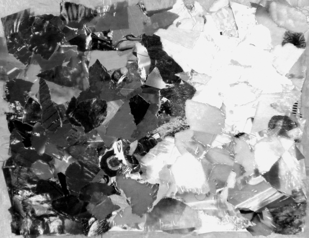
For this collage, we had very few rules; no creating any actual image (abstract-ish) and our final result needed to represent one of the 6 elementss of design. I started out with the idea of texture as my focus, however as I laid out all the bits and pieces of the texture photos on the table that I had ripped out of magazines, I began to realize all the color in the pictures! I emphasized the cool colors on one side and warm colors on the other, grouping them in color patches~ overlapping them to also form a unique design. The black and white copy on the right is suppose to show the value that color shows. Notice how all the warm colors are similar in shade, you almost can't tell red from yellow, and the same with the cool colors in that they look dark.
 RSS Feed
